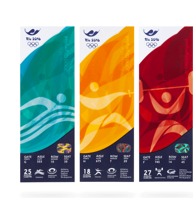
As the world slowly but surely has realized that we are becoming more and more one global community, the cultural message of inclusion and acceptance of diversity is being incorporated and highlighted in countries vying for a chance to host the Olympic games. Rio is no different and an excellent platform which shows that with joy, resilience and continued forward movement, one can go faster, climb higher and become stronger.
The visual direction for the mark is a reinterpretation of the olive branch for Rio. This symbolizes the diversity of the people and the landscape.
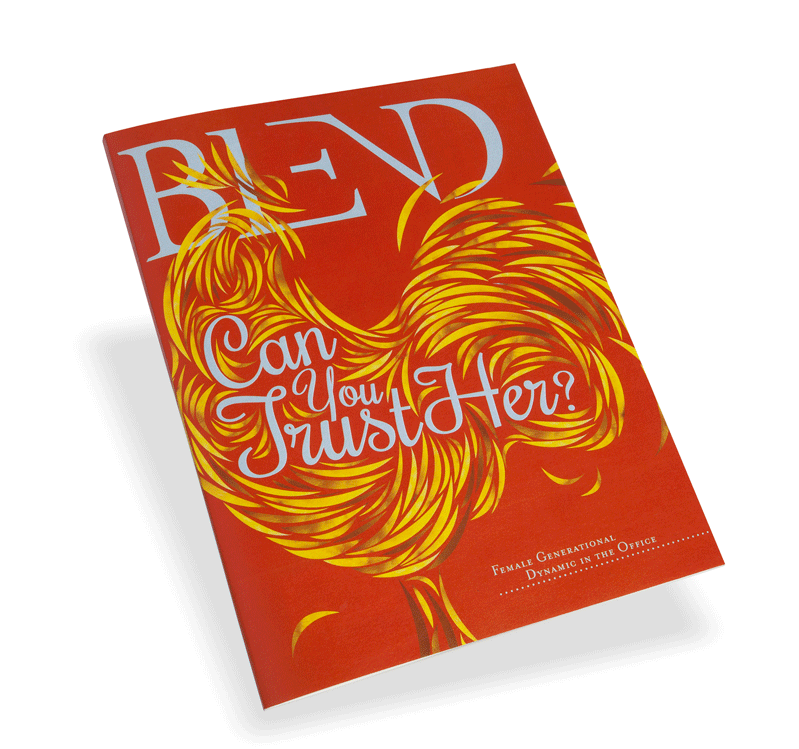
Blend magazine is a mesh of serious/relevant tops for the "multifaceted" woman presented in a visually entertaining way.
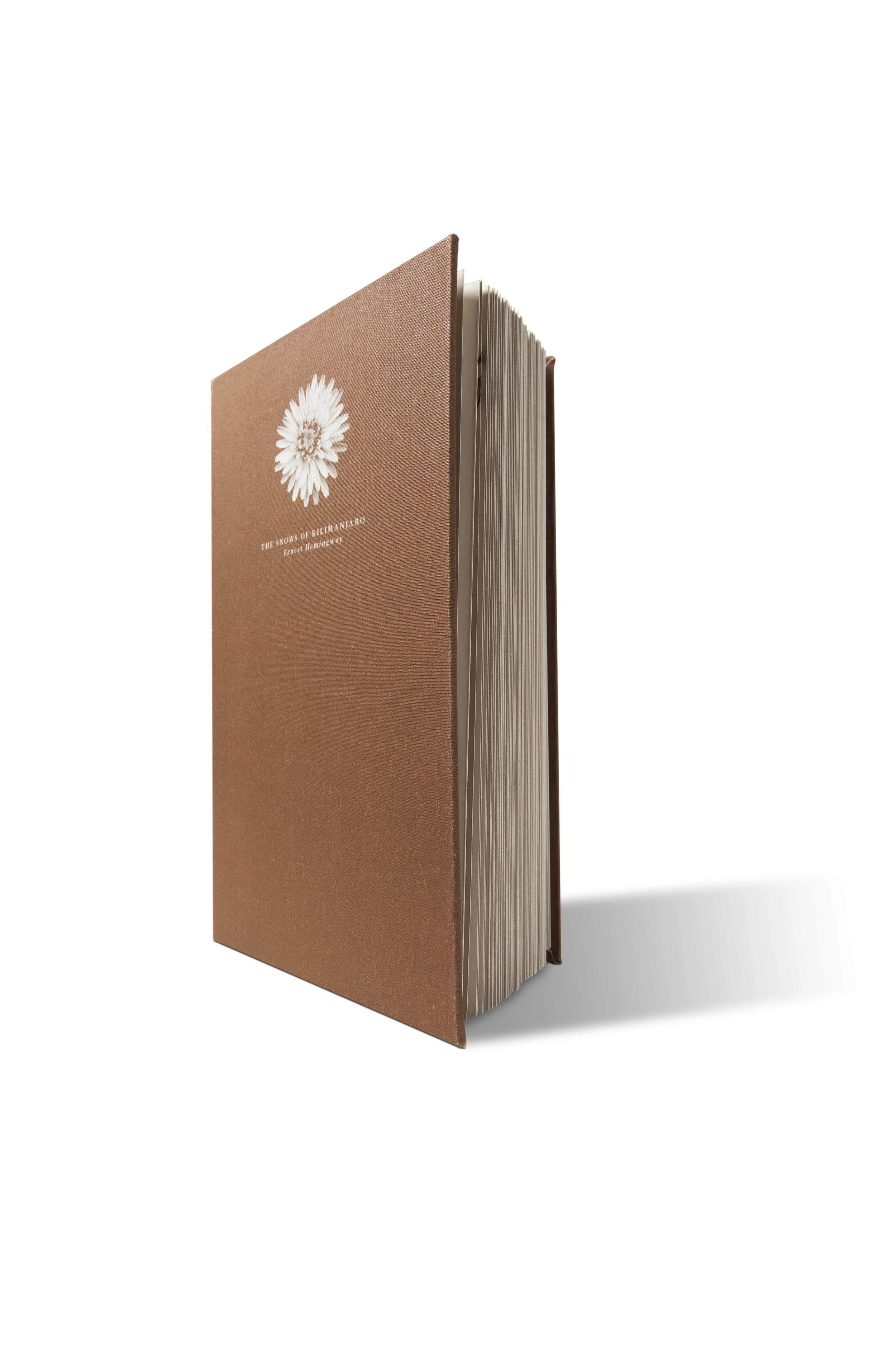
A short story about a man on the brink of death, coming to terms with his life’s regrets and missed dreams never to be achieved. The book is designed to show the fragility and unpredictably of life. The symbolism of a dandelion in bloom is used on the cover to show the hope and dreams most have for their lives, while the inside cover and through various spreads the other side of the dandelion is revealed to show the true reality of life; Fragile, unpredictable and the sometimes the revelation of death. Kept hidden in the book’s folios is main the character’s emotional journey of regret transformed into forgiveness and finally peace with his impending death.
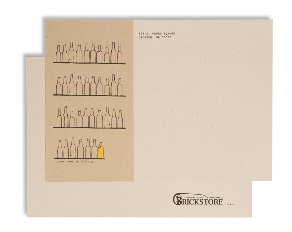
Nestled in the heart of downtown Decatur, Brickstore provides its customers with an atmosphere comparable to the birthday celebration of Bilbo Baggins in The Hobbit movie. Naturally all hobbits know their beer as does Brickstore, carrying some of the rarest beers in the U.S.
Because of their wide selection of beers and great atmosphere, the pub can get very packed causing frustration for those trying to flag down their waiters.
The “May Day” block solves that problem by allowing the customers to communicate with their waiters.
(1. Place block at end of table 2. Continue with your conversation 3. Your waiter sees your signal for help and comes to your aid.)
The Brickstore staff is very particular in serving their beers in the proper glassware. So instead of the standard match stick box, a deck of cards would be provided, providing knowledge on the different glassware and what beers go best with them.
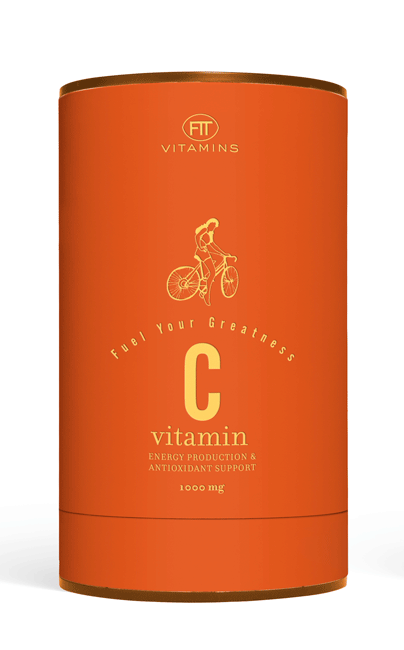
A vitamin brand for young women starting to take vitamins. For their on the go life styles, the packaging comes with a dispenser system, allowing easy portability and awareness of consumption and refill.
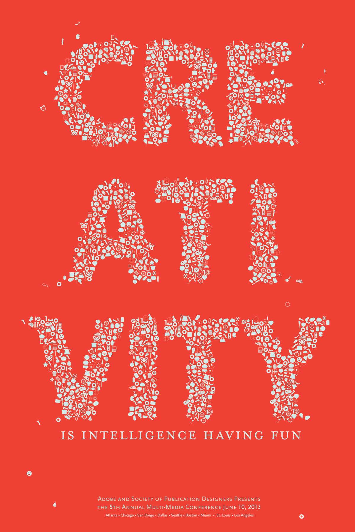
Fun Poster exercise interpreting the quote, "Creativity is intelligence having fun."
For me the quote simple means the ability to create anything new with what ever sounds you. The word creativity is created using random found objects. The found objects represent zeros and ones for binary coding(since the poster was created for a multi-media conference).
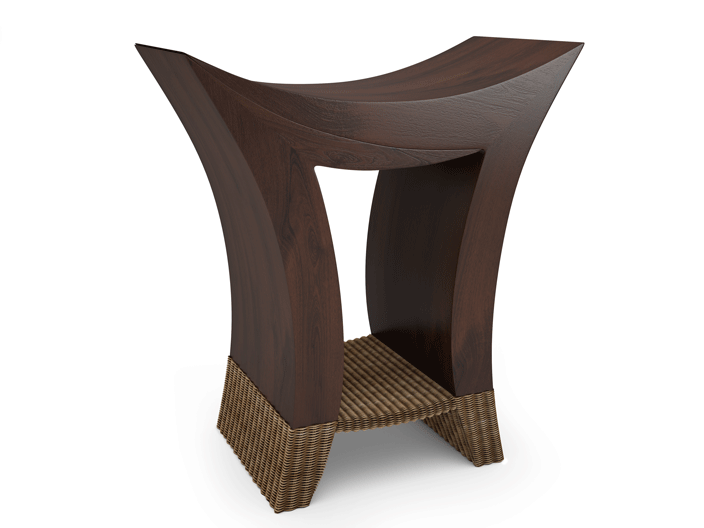
A chair representing the struggles of our past and the ability to forgive, support and help those who contributed to the struggle.Through forgiveness of each other can both be truly strong. The point of forgiveness is a raw state of vulnerability that one must face in order truly achieve forgiveness.
The physical form of the chair shows two opposing forces coming together in harmony to create a strong base. The wicker represents the sense of vulnerability we must have to achieve forgiveness. In order for one to sit in the chair, they must trust the wicker is strong enough to hold them.
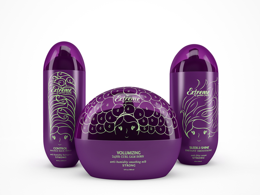
No matter how outrageous or daring the hair style, mother nature usually succeeds in bringing the style down to size. With this limited edition packaging, mother nature is no longer a threat. Whether it is rain, wind or sunshine, Garnier protects and allows you to own your style.
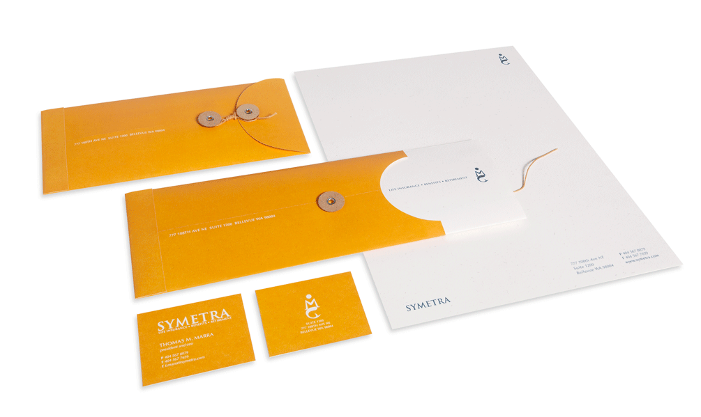
Symetra, an insurance company, prides itself on being friendly, approachable, knowledgeable and providing personalized service.
During the journey of life, there are important financial milestones, that require attention and guidance. The identity system highlights this ideal through the old sailing myths of mermaids guiding ships at sea during their voyages. The visual direction is simplified to have a modern edge. The use of the one singular color represents the strength of one source providing excellence to its clients.